Website Re-Design Client
Features on the Orchard Coaching website
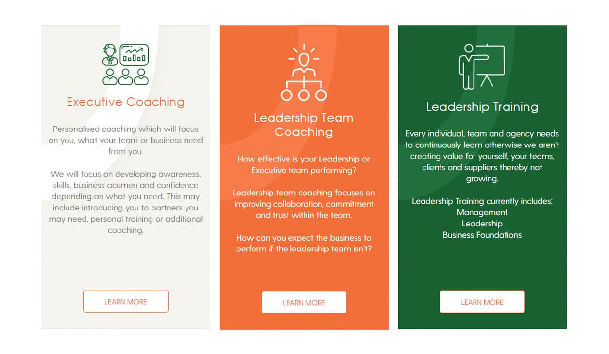
Each service has its own page, with a clear description of the benefits and outcomes that clients can expect. The website also features a testimonials section, where clients can share their experiences of working with Orchard Coaching and provide feedback on the impact of their coaching.
- New iconography to show off services
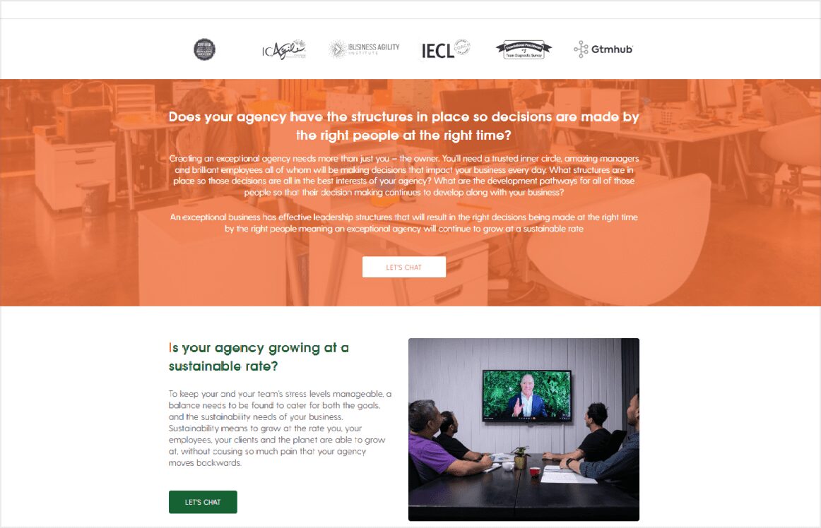
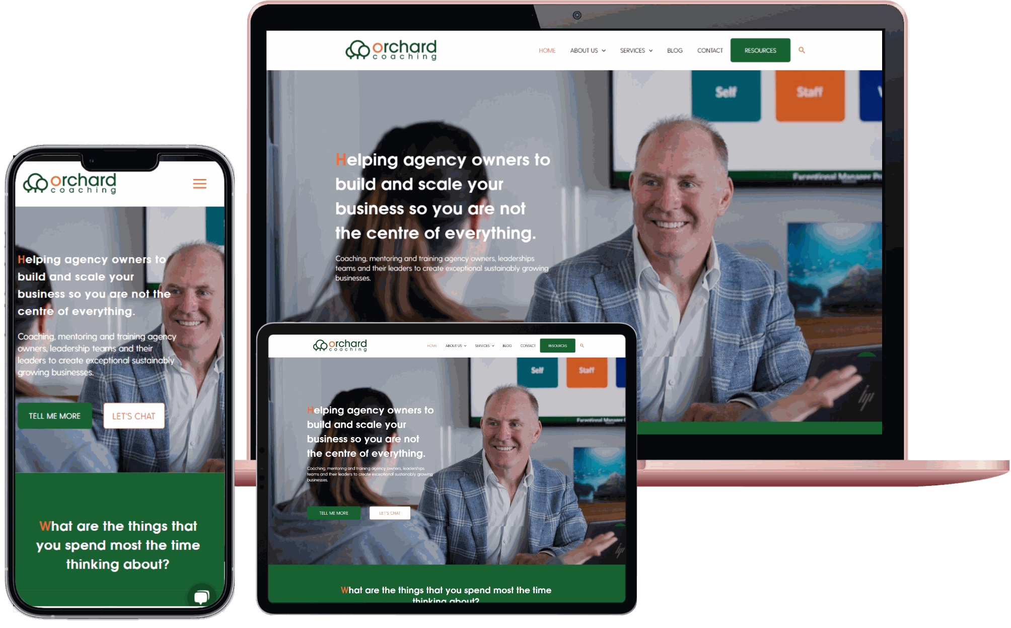
- Banners images with overlays
- Pop ups linking to CRM
- Great use of the brand colour palette and implementation of brand guidelines throughout the design
- Strong focus on imagery that focused on agencies which is the main demographic
- Clear calls to action throughout the site
- Entry pop up
- Entire resources page that have pop up forms for each resources
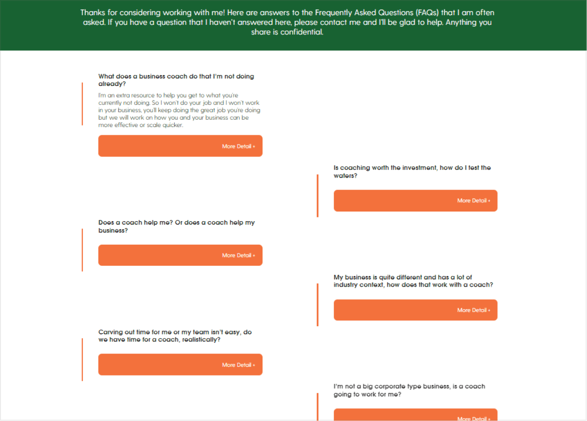
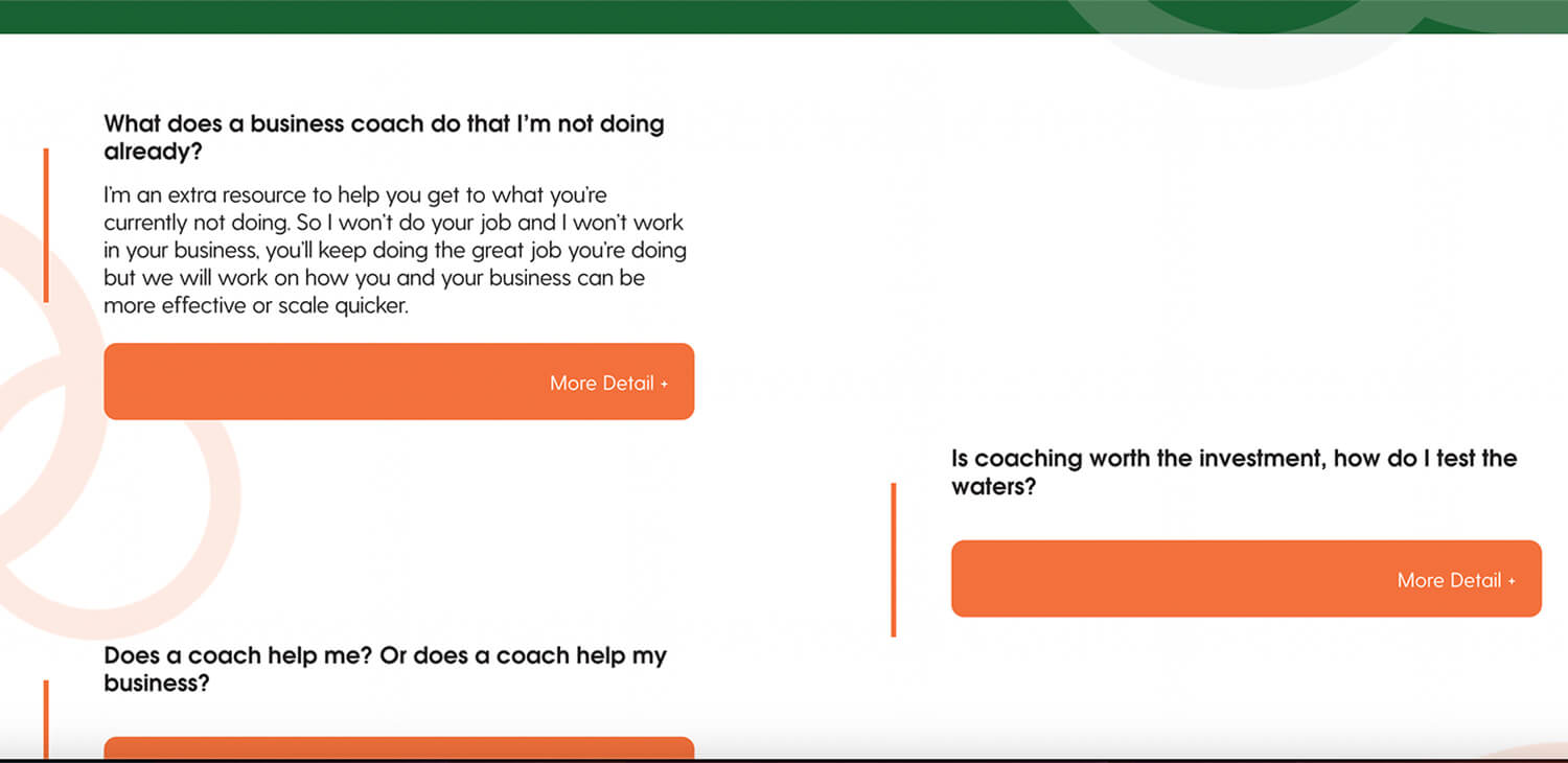
- Drop down FAQ page
Our Highlights
Some of our favourite features

Great use of colour
Colour is important on any website, but using it effectively in a design can be challening. We love how this design all came together with a good use of white space, hints of forest green, and orange to brighten it up to give it some vibrant energy.
Mobile Responsive
All of our websites are fully mobile responsive. We want to make sure that they look just as good on mobile devices as they do on a desktop.
The website is a user-friendly and engaging platform that effectively showcases Orchard Coaching services and expertise.
Our team at The Site Coach is proud to have worked on this project and delivered a website that meets the Client’s needs and exceeds their expectations.
The new website has helped to increase the visibility of Orchard Coaching and is helping to attract new clients, while also providing a valuable resource for existing clients to support their ongoing growth and development.
CLIENT LOVE
Melissa Spilstead
Hypnobirthing Australia, Gold Coast, QLD

Great experience, time frame was great, support excellent and quick!
Kirsty Fantini
Early Years Training, Glenorie, NSW

Paulette Davis
Bahamas Wedding Planner


